The Handover Plan: Anatomy of an AI Rollout Working Session
Every Settle Claude rollout ends with a single-page document. Eight rows, four modes, a progress bar at the bottom, and one line at the top that does more work than the rest of the page combined.
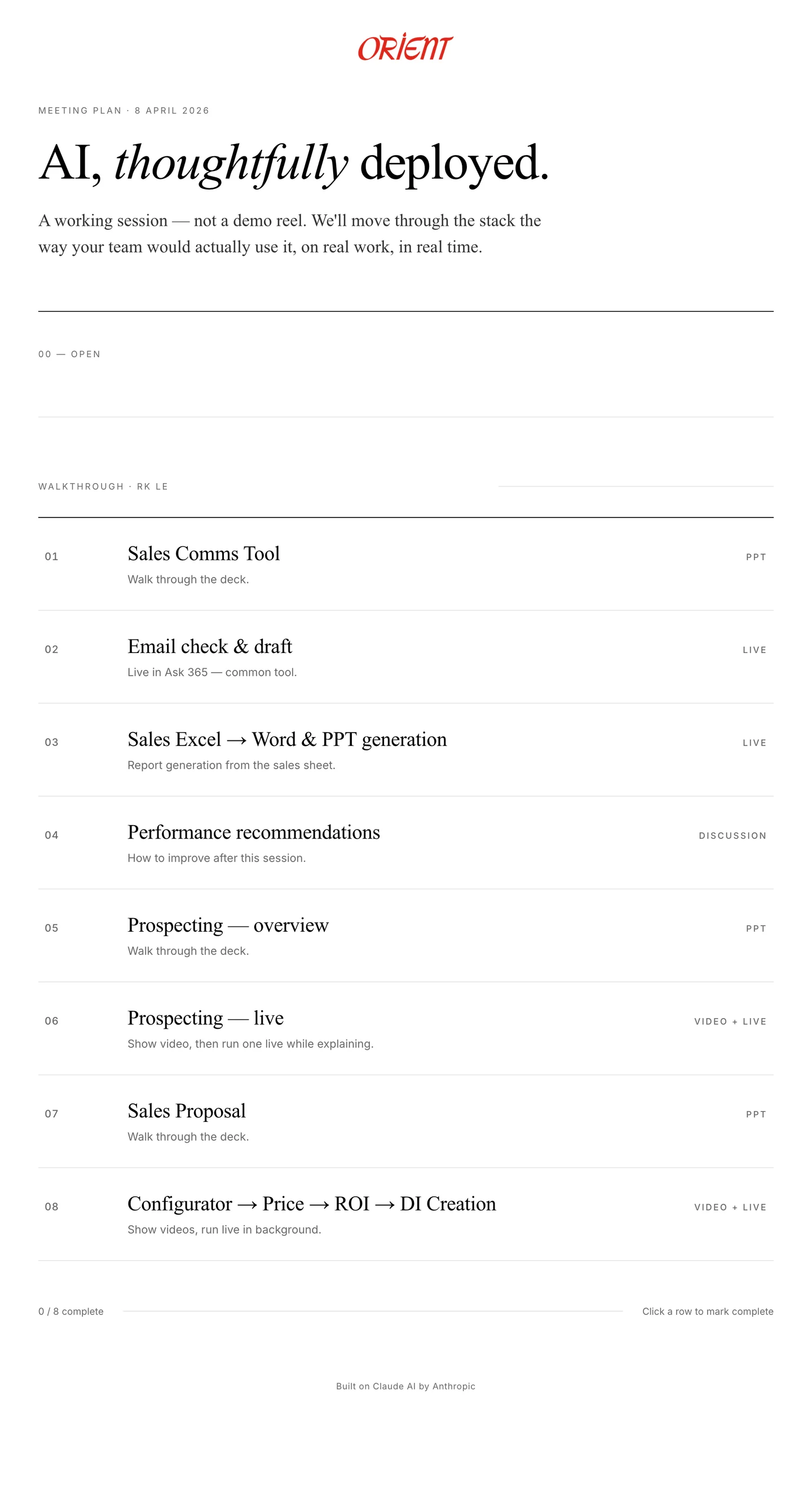
Before every Claude rollout handover, we prepare a single page. Not a deck. Not a Notion doc. A thoughtfully typeset page with the client's logo at the top, a headline in serif italic, a two-sentence lede, and eight rows representing the eight tools we're about to put in front of the team.
At the top of that page, above everything else, is the line that does more work than the rest of the document combined:
A working session — not a demo reel. We'll move through the stack the way your team would actually use it, on real work, in real time.
Everything else on the page is an argument for that sentence. Here's what the rest of the page looks like, and why every detail matters.
A page, not a deck
The first thing people notice when I pull up the handover plan on the projector is that it doesn't look like a slide. It's a typeset page. Wide reading column, serif display type for the headline and row titles, hairline rules between sections, the client's logo centered at the top in their actual brand colour. It looks the way a magazine article looks, not the way a sales deck looks.
That's intentional. A deck tells a story to an audience. A page invites you to read, pause, and come back. We want the second reaction, not the first. The meeting isn't a presentation to sit through. It's a working document to lean into.
The other thing that matters about the format: it fits on one screen. I've run handovers where the agenda was a ten-slide deck and the team lost the thread by slide four. A single page keeps everything in view. At any moment, you can glance up and see where we are, what's done, and what's still coming.
Why the first row is labelled 00
The walkthrough is numbered 01 through 08. The opener is numbered 00. That's on purpose.
Row 00 is titled “Open.” The body reads, roughly: the founder opens with how to think about AI, then walks through a tour of our Claude. Two things, in order, both required, neither involving a specific tool.
The first half is framing. Fifteen minutes, no screens, no demos. Just a conversation about how to think about AI at all. Claude isn't a search engine, it's a colleague. It has context you give it, memory you structure, and rules you write. The quality of what you get out is proportional to the quality of what you put in.
I used to skip this. I thought people would find it condescending, or that they'd want to see the tools immediately. I was wrong on both counts. A rollout without framing fails in a specific way: the team sees the demo, goes back to their desks, and within a week they're using Claude the way they'd use Google. Type a question, copy the answer, move on. Nothing has shifted in how they think about the thing.
The second half of row 00 is a tour of the Claude setup itself. Not the tools yet. The environment. This is where their projects live. These are the instructions we wrote. This is the knowledge file that encodes their pricing logic. These are the safety rules that prevent internal cost data from leaking into customer-facing documents. Fifteen more minutes, still no specific tool, and by the end of it everyone in the room has a mental model of the substrate before they see anything built on top of it.
Zero-indexing matters. The opener is not step one. It's everything you need before step one makes sense.
Eight rows in the order you actually reach for them
Below the opener, a section divider labels the next block as the walkthrough and names a role split: one of us drives, the other adds context live. That role split is the same on every handover. The engineer on our team opens the Claude project, types the sample input, walks through the output. I jump in every few minutes to name what we're seeing, why it was built that way, and what to watch out for.
Neither of us could run the session alone. If the engineer did it solo, the tools would look like magic tricks. If I did it solo, I'd skip the mechanics because I wrote them and I'd get bored. Together we make it feel like what it actually is: something a small team built carefully, now being handed off a piece at a time.
Then the eight rows. Each one has a number, a title, a one-line note, and a mode on the right. For a sales team handover they look like this:
- Sales Comms Tool — walk through the deck
- Email check and draft — live in the team's actual email client
- Sales Excel to Word and PPT generation — report generation from their sales sheet
- Performance recommendations — how to improve after this session
- Prospecting — overview of how it works
- Prospecting — run one live while explaining
- Sales Proposal — walk through the deck
- Configurator to Price to ROI to DI Creation — show video, run live in background
Read that list the way a salesperson would. It's literally what they do in a week. Check the inbox, draft replies to customers, turn the sales sheet into a report, figure out what to improve, prospect new leads, write proposals, configure machines and price them out. Every tool shows up in the order they'd naturally reach for it.
I got this wrong for a while. I used to sequence handovers by tool complexity — start with the easy ones, work up to the impressive ones, so the team builds confidence as they go. The problem is that “tool complexity” is a Settle-internal metric. Nobody on the client side cares. What they care about is the order they'd actually use these things on a Tuesday morning. Sequencing by workflow instead of by complexity reframed the whole meeting. The session stopped being “here are the eight things we built” and started being “here's what Monday morning looks like when you have these tools.”
Four modes, chosen on purpose
On the far right of every row is a status tag. There are only four values it can take: PPT, LIVE, VIDEO + LIVE, or DISCUSSION. I used to think mixing modes was messy. Now I think it's the single biggest thing that makes these sessions work.
PPT earns its spot when a tool has moving parts that matter more than the output. Prospecting is a good example. The actual output is an email draft, which is genuinely boring to watch get typed. But the thing that makes it useful — how Claude pulls the prospect's company profile, finds the decision-maker, drafts in the client's tone, references the right case study — is all hidden under the hood. Four slides up front make it visible before we run anything live.
LIVE earns its spot when the output is the point. Email drafting is the opposite of prospecting: there's no interesting backend, but watching Claude read a customer's actual enquiry and draft a reply in about eight seconds is the part that lands. Nobody in the room has ever done that before. You can feel it change the air.
VIDEO + LIVE is for the tools where a pure live run would take too long. The configurator chains four steps: configure the machine, price it out, calculate ROI, generate a deal intelligence doc. Running all four end-to-end live is a twenty-minute commitment, and the middle ten minutes are quiet. So we play a tight two-minute video that shows the full arc, then kick off a live run in the background and come back to it at the end of the session when it's done.
DISCUSSION is the most important mode and the one I had to learn to take seriously. It's the mode where we close the laptop. On our handover plans it's reserved for row 04: performance recommendations — how to improve after this session. More on that in a second.
No mode is better than the others. The trick is matching the mode to what the tool is trying to prove.
The progress bar is the deliverable
At the bottom of the page there's a thin horizontal line, a small counter that starts at “0 / 8 complete,” and one instruction in muted grey: “Click a row to mark complete.”
The page is interactive. As we finish each tool, we click the row. A line strikes through the title, the counter ticks up, the progress bar at the bottom fills in. By the end of the meeting the document isn't a plan anymore. It's a log. Eight rows with lines through them, a full progress bar, a timestamp we don't need to write down because the page itself is now the record.
This sounds small. I think it's the thing that makes handover meetings feel like real work instead of a presentation. Every click is a moment the room agrees that something happened. The tool was demonstrated. The team saw it on their own data. It's now part of their workflow, not a pitch.
When I started doing handovers I ended them with “any questions?” and got polite silence. Now I end them with a page full of strikethroughs and a conversation about what comes next. That change was almost entirely about the footer of a single document.
The handover is the product
One last detail. The handover plan isn't a one-off Google Doc. It lives inside our internal dashboard, and the dashboard has a few zoom levels worth showing. Bear with me — this is the only place in the post I'll talk about the machinery behind the meeting.
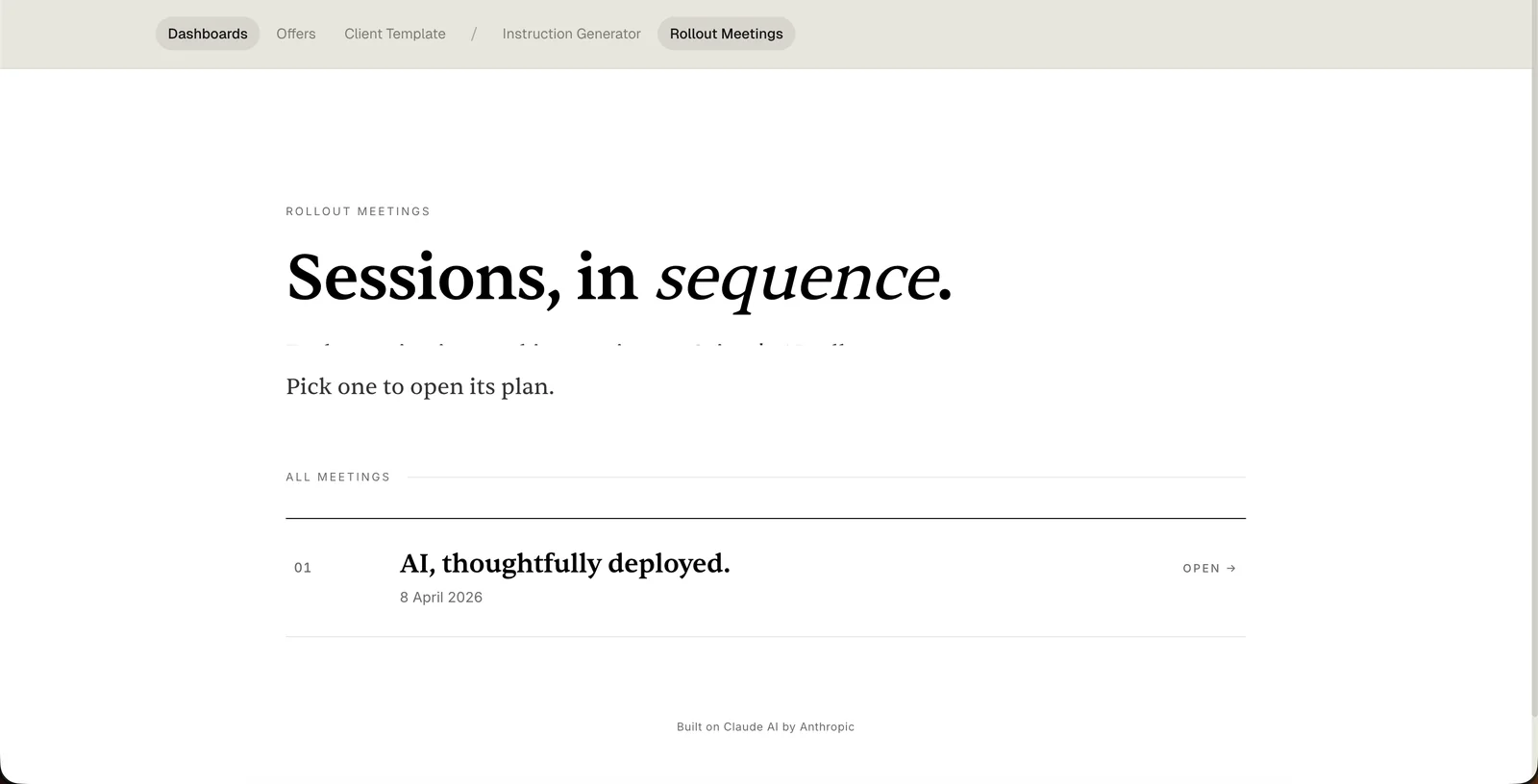
Zoom level one. Every client we run a handover for has their own page that lists every meeting we've had with them, in order. Each row is its own working document. The headline at the top is the closest thing we have to a mission statement: Sessions, in sequence.
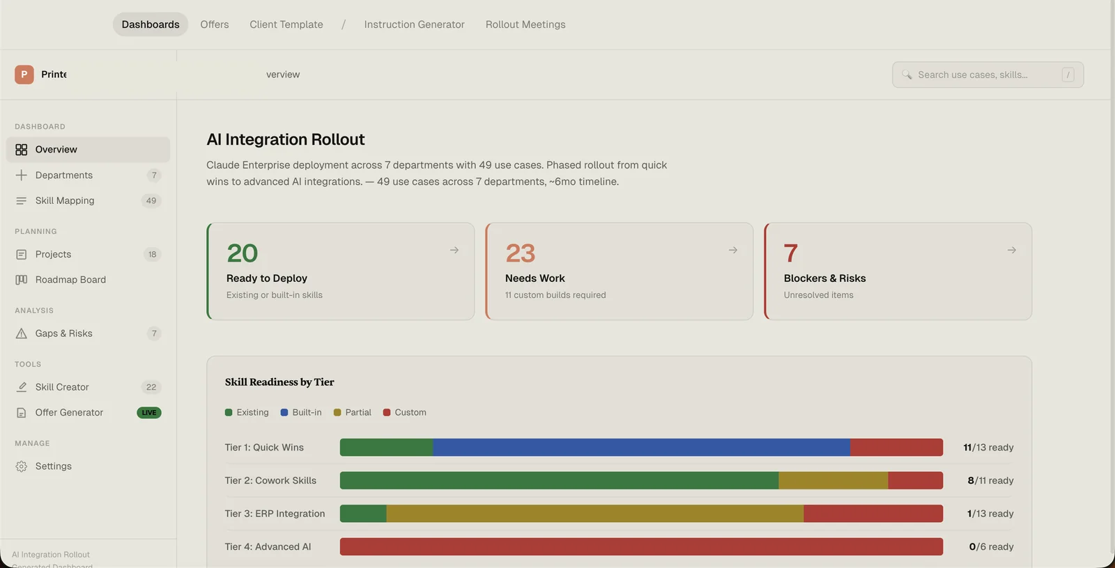
Zoom level two. Each of those clients has a full rollout dashboard underneath the meetings list. This is where we track every use case, every project, every skill, every blocker, every gap. The meeting plan I've been describing for the last 1,500 words is one tab in this thing. Everything else — all the architecture and instruction work that happens before handover day — lives here.
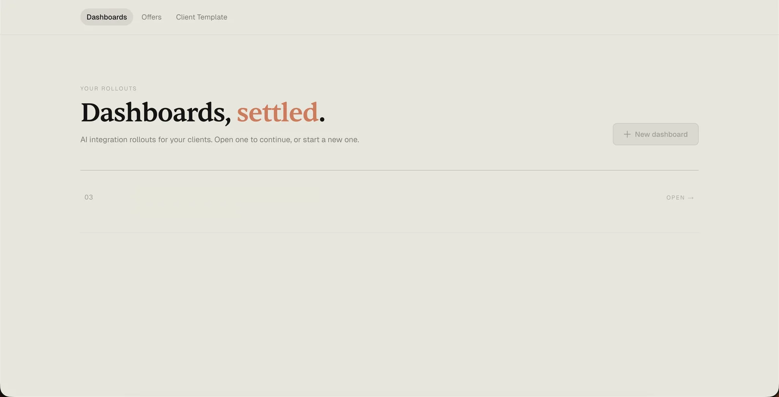
Zoom level three. And those rollouts all live inside one top-level index. New rollouts get added here. Old ones get archived here. It's the “all clients” view I open first thing in the morning to see what's in flight.
I'm showing you all of this so the next paragraph lands properly.
For a long time I thought the product was the instructions. Then I thought it was the architecture. I now think it's the handover — and more specifically, the single page we put on the projector when it's time to go live.
The instructions are scaffolding. The architecture is the frame. The thing that actually ships — the thing that determines whether the client is still using Claude in month six — is the two-hour meeting where real people see their real workflows run on their real data for the first time. And the page we run that meeting from is the closest thing we have to a physical deliverable.
That's why we put so much weight on it. That's why the layout is what it is. That's why row 00 exists. That's why the status column has four values and not five. That's why there's a progress bar at the bottom instead of a “thanks for watching” slide.
If you're thinking about deploying AI across your team, the thing to optimise for isn't the number of use cases you map or the number of tools you build. It's the day someone on your team walks out of a meeting and thinks, “I can actually use this tomorrow.”
Everything else is scaffolding for that moment. Start a conversation →
Founder of Settle. Deploys Claude AI into mid-market companies and manufacturers — structured rollouts, production-grade instructions, real results.