Orient's Old Site vs the New One: A Side-by-Side Walkthrough
Most B2B manufacturing websites are brochures. A homepage carousel, a products dropdown, a few PDF downloads, and a “Request a Quote” button. We rebuilt The Printers House Orient's site from that template into something that actually answers customer questions on its own. Here's the side-by-side, screenshot for screenshot.
The headline number
Before any of the design or copy choices, here's the most striking thing about the redesign.
The old homepage is exactly 900 pixels tall. One viewport. The new homepage is 14,830 pixels tall.That's a 16x increase in content depth, and it's not because we padded it with stock imagery and team photos. Every additional pixel does work — surfacing product specs, answering customer questions, showing the global installation footprint, enabling self-serve discovery.
The old site treated the homepage as a holding area that pushes you to subpages. The new site treats the homepage as the product itself.
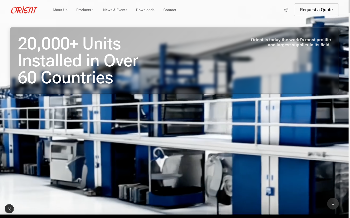
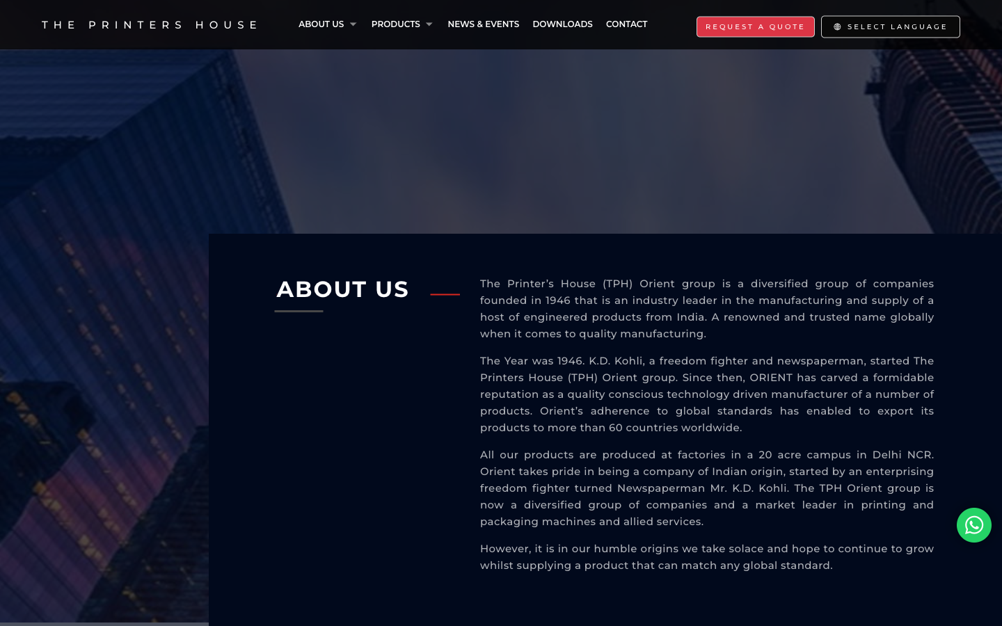
Hero section: same fact, different confidence
Both sites lead with the same fact: 20,000+ units installed, 60+ countries, since 1946.That's the credibility anchor and we kept it. What changed is how the fact is delivered.
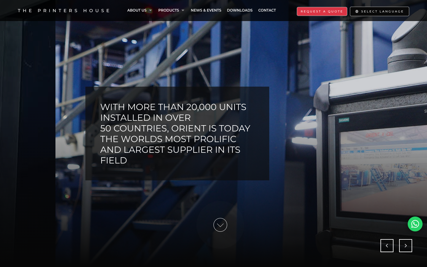
Three things changed in the hero, and each one is doing real work:
- Title case instead of all-caps. All-caps reads as shouting and is harder to scan. Title case is more confident — it doesn't need to raise its voice to be heard.
- Light background instead of dark overlay. The old hero put copy on top of a moody industrial photo with a translucent box. Readable but heavy. The new hero gives the copy room to breathe.
- One CTA instead of three. The old hero has “Request a Quote,” a language picker, a slide arrow, a WhatsApp bubble, and a scroll cue all competing for attention. The new hero has one primary action.
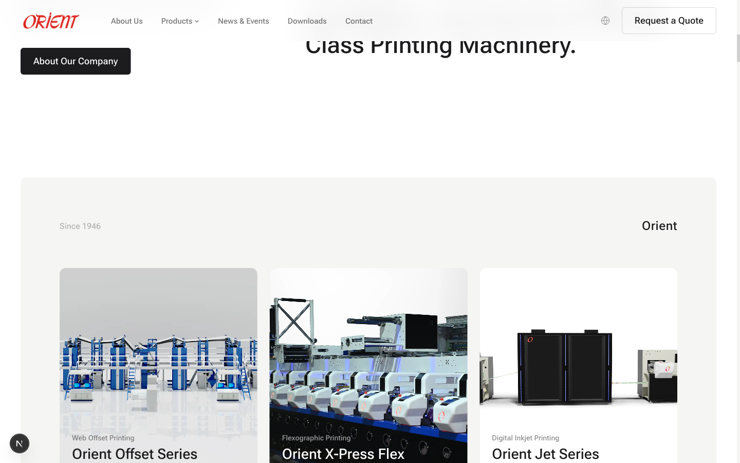
Products: from dropdown menu to visual catalogue
On the old site, finding a specific Orient machine meant hovering on “Products,” navigating a multi-level dropdown, and landing on a static page. The product catalogue was hidden behind menus.
On the new site, the product catalogue is a visual grid right on the homepage. Three large cards, each with a category label, a hero shot of the machine, and the product name. No menus, no dropdowns, no hunting.
Product detail: from a hero shot to a structured spec sheet
Click into any machine on the old site and you got a single hero image of the press, a category title, and not much else. To find the actual specifications, you had to navigate to the Downloads tab and grab a PDF catalogue.
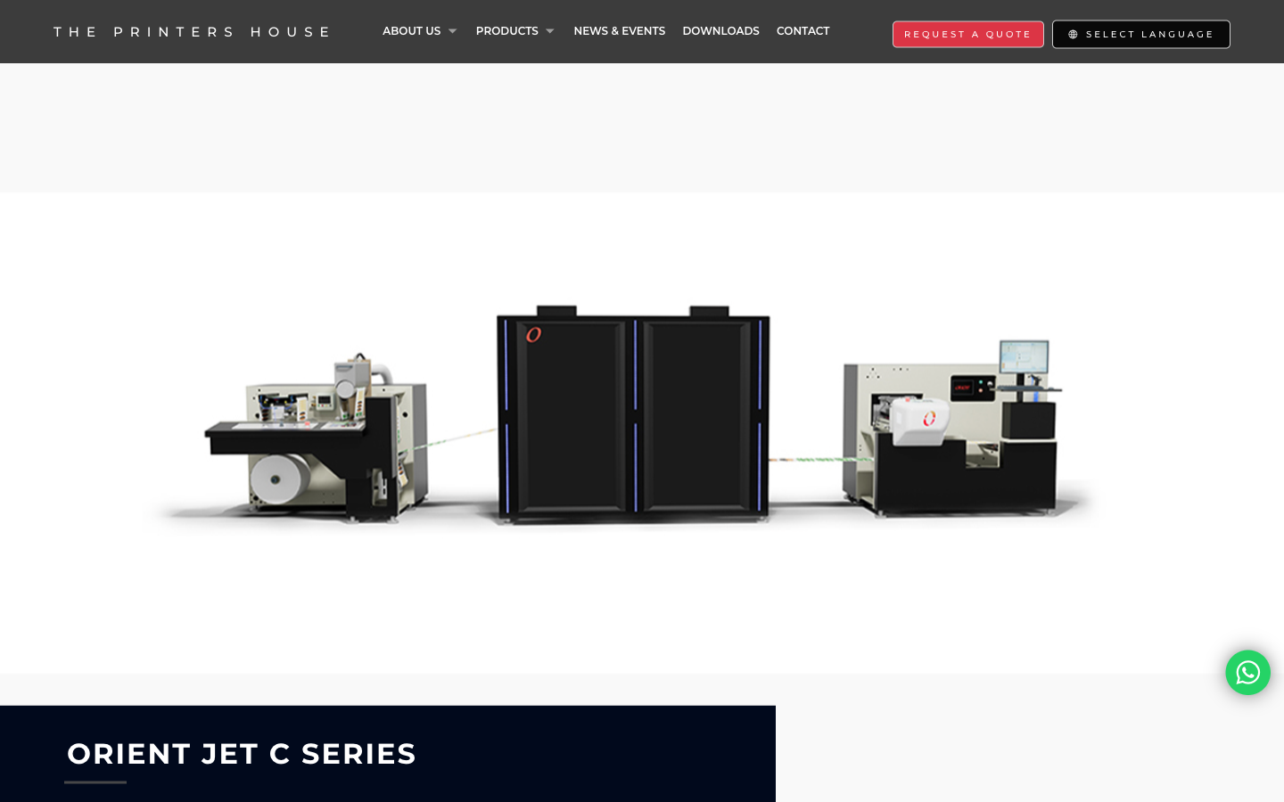
Click into the same machine on the new site and you get a complete product detail page. A gallery of machine views with thumbnails. A hero image. A description. A “Key Features” list. A specifications table. An “Ask Orient AI” button right next to a “Request Quote” button. Everything a buyer needs to make a shortlist decision, without leaving the page.
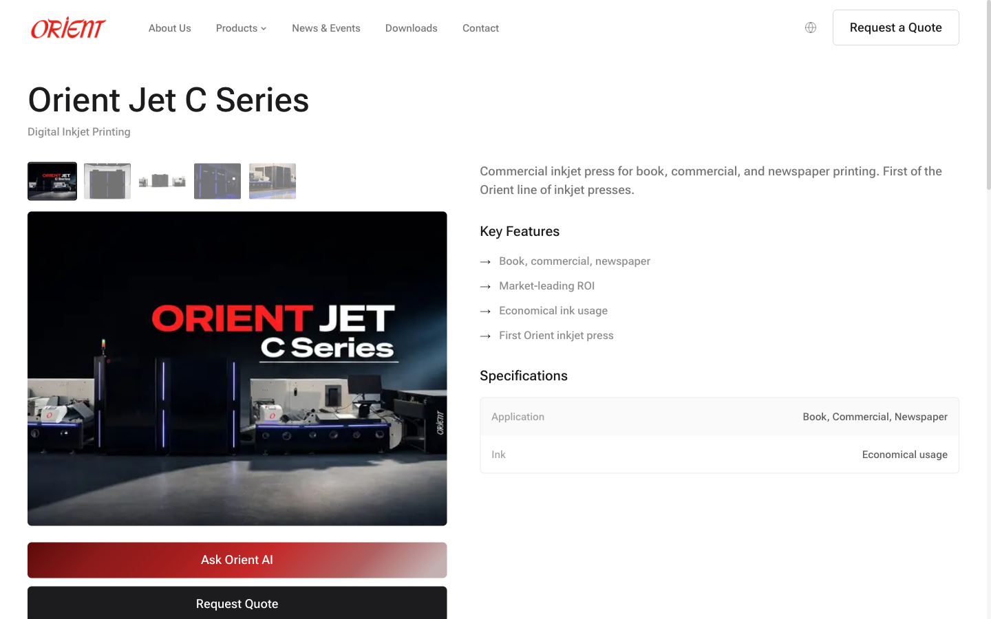
The old page made the buyer work to find anything. The new page does the work for them.
The specifications page: where the real shift happens
This is the comparison that matters most. On the old site, getting actual machine specs meant downloading a catalogue PDF. On the new site, the specs are on the page — and there's an AI chat trained on the same data to answer follow-up questions.
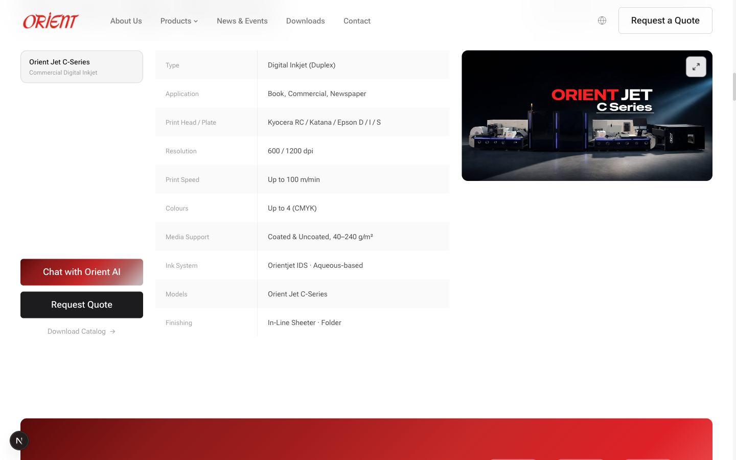
Ten spec rows visible at a glance. Type, application, print head, resolution, speed, colours, media support, ink system, models, finishing. Pulled directly from the same internal knowledge base Orient's sales team uses to generate customer quotations. If a number changes in the source, it changes here.
And then there's the chat.
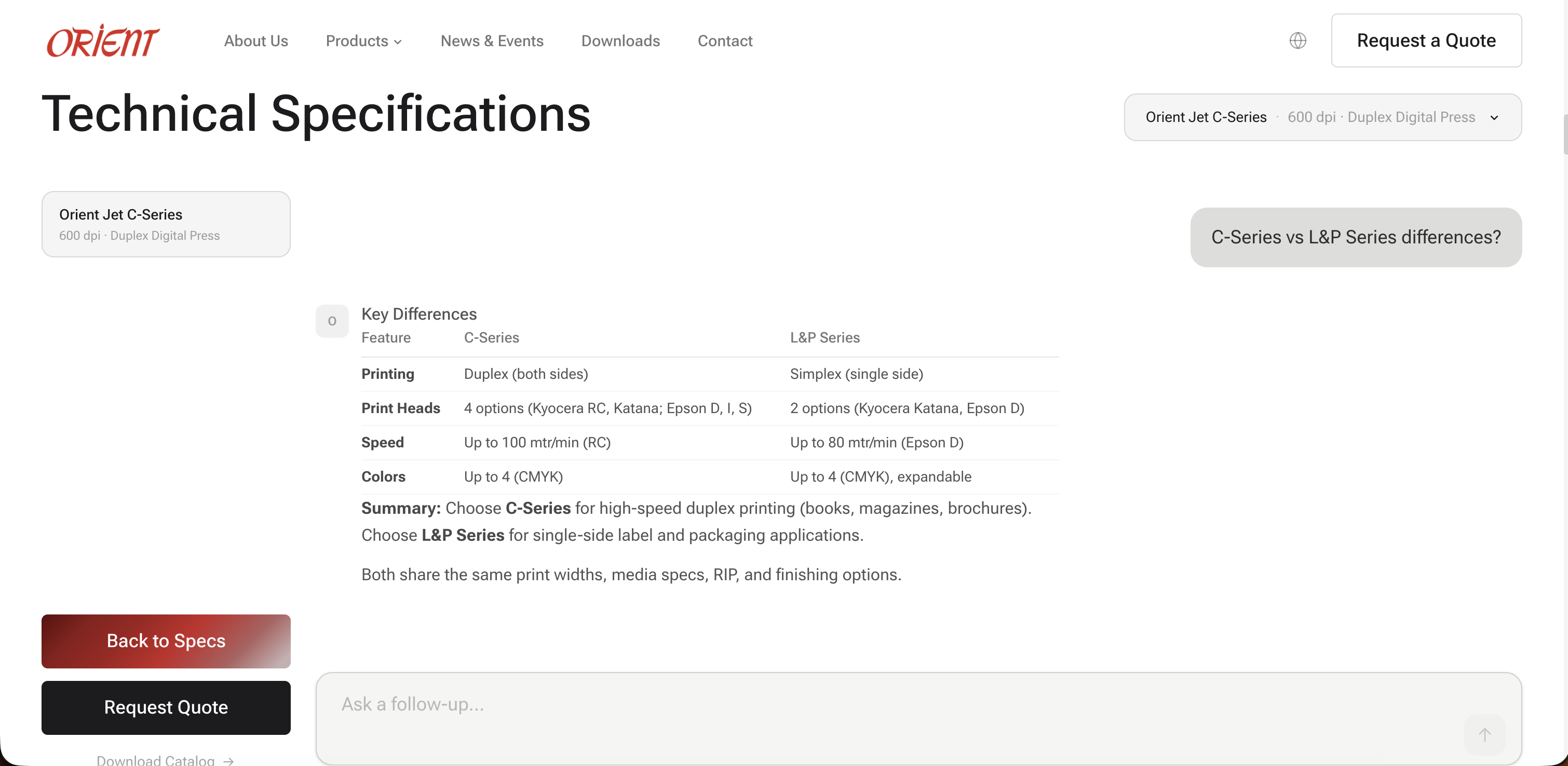
On the old site, a prospect at 11pm in Germany who wants to know whether the L&P Series can do duplex printing has two options: download a PDF and search it, or wait until Indian business hours and email the sales team. On the new site, they ask. They get an answer in seconds. The answer is accurate because it's drawn from the same knowledge base that powers internal quoting — there's no opportunity for the chat to invent specs the team would later have to walk back.
Global reach: from a list of countries to an interactive map
Orient has machines installed in more than sixty countries. On the old site, that fact lived as a sentence in the About paragraph. There was no map, no list, no visual evidence — just the claim, dropped into a wall of text and easy to miss.
On the new site, that same fact gets a dedicated section with an interactive 3D globe and a row of country pills. Hover the globe and it rotates. The country pills are real — every name on the list is a country with installed Orient machinery. The visual makes the “sixty countries” claim feel concrete instead of marketing copy.
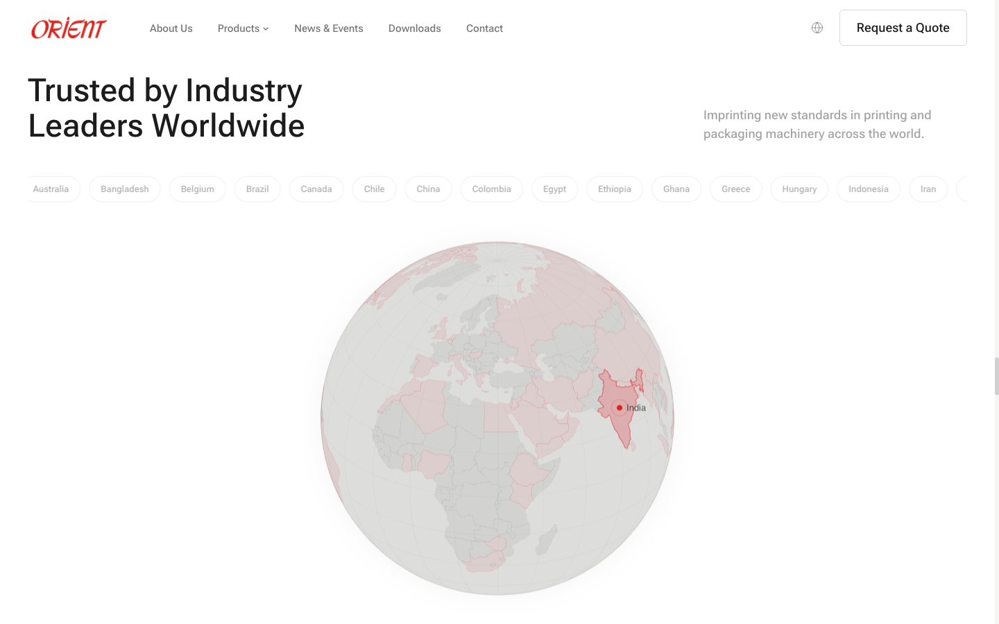
This is one of the sections where the comparison becomes “new vs nothing.” The old tphorient.com simply does not have this. There's no map. There's no globe. There's no visualisation of where Orient operates. The claim of global reach exists; the proof of it does not.
About Orient: from a paragraph to a heritage walkthrough
For an eighty-year-old manufacturer, the About page is one of the most load-bearing surfaces on the entire site. It's where a serious buyer goes to decide whether the company is real, whether the heritage is real, whether the team is real. So how did each version handle it?
On the old site, the About page is three paragraphs of text on a dark moody background. Two thirds of the screen is a stock photo of an industrial building. The remaining third is body copy that reads as a corporate boilerplate written sometime in the late 2000s. The content is fine. The presentation hides it.
On the new site, the About page is a single scroll. It opens with a clean photo of the Delhi NCR factory campus, an introductory paragraph, and a stat grid: 79 years, 20,000+ units, 60+ countries, 10 offices. Then it descends into the heritage proper — a 1946→2025 timeline marking nine inflection points across eight decades. After that: the three production plants. After that: the three generations of leadership. After that: the supplier hub with logos. After that: the patron grid showing every country Orient ships to.
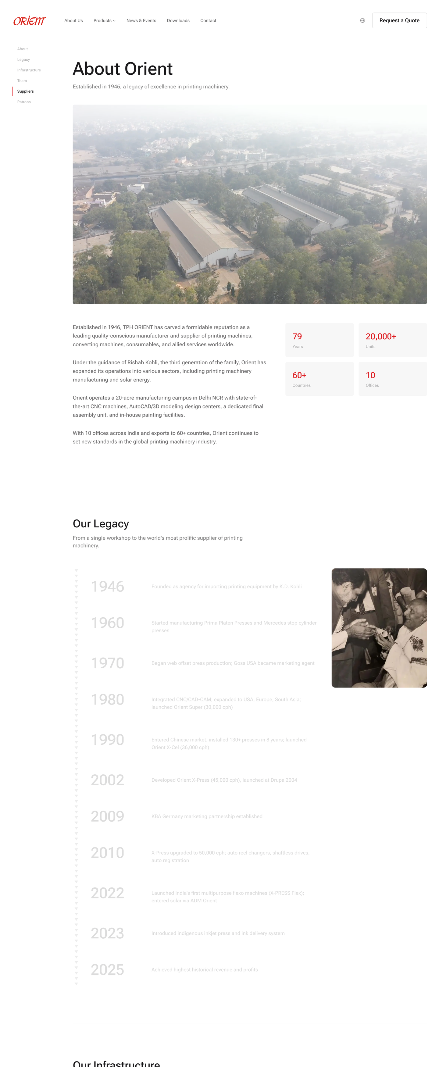
The old site had this content too. It was just spread across four separate subpages — Our Legacy, Our Infrastructure, Our Team, and a Patrons list — each one a sentence and a static image. Buyers would have had to click through four pages to assemble what the new site puts on one scroll. Most buyers don't click through four pages. They form their judgement from the first page that loads, which on the old site was the three-paragraph text wall.
The new About page rewards the buyer for a single scroll. That's the entire change.
What stayed the same (on purpose)
A redesign isn't a teardown. There are things the old Orient site did right that we deliberately preserved.
- The 1946 heritage line. “Imprinting Excellence Worldwide Since 1946” lives on as the page title and is referenced throughout the site. Eight decades of manufacturing isn't something you bury — it's the entire reason a prospect trusts the spec sheet in the first place.
- The Orient logomark in red. Same wordmark, same colour, same italic. The logo is the most recognisable thing in the printing-machinery industry for this brand. Touching it would have been arrogant.
- The “20,000+ units in 60+ countries” credibility anchor. Same fact, more confident delivery.
- The “Request a Quote” CTA. Manufacturing buyers expect this button. We kept it — but instead of being the only path forward, it's now one of three (browse specs, ask the AI, or request the quote).
The strategic shift
The redesign isn't really about visual polish, even though the visual polish matters. It's about a shift in what the website is for.
The old site was a brochure. Its job was to make Orient look credible long enough for a buyer to fill out the contact form, after which a salesperson would do the actual work of explaining the products. The website existed to schedule the conversation.
The new site isthe conversation — at least the first half of it. A prospect can land on the homepage, identify which machine line fits their use case, read the actual specs, ask follow-up questions in natural language, and only then decide whether they want to talk to a human. By the time they fill out the quote form, they already know what they're asking about.
That changes everything for the sales team. The conversation that used to start with “tell me about your machines” now starts with “I'm interested in the Jet L&P 432mm with UV curing — let's talk delivery and pricing.” Sales cycle compresses. Junior reps stop spending half their day on basic-spec questions. The sales engineers get their time back for the conversations that actually need them.
Same knowledge, three surfaces
The reason this redesign was even possible is that the foundation already existed. Orient's sales team had been using a structured Claude AI project (built during our earlier engagement) to generate customer quotations. That meant their machine specifications, pricing logic, and terms were already codified in a clean, maintained knowledge base.
The new website doesn't use a separate content system. It pulls from the same knowledge base. So does the AI chat widget. One knowledge base. Three surfaces. All consistent.When Orient updates a print head spec internally, it propagates to the spec table and the chat's answers in the same moment.
That's the part that makes this approach worth talking about. Most B2B website redesigns end up creating anothersource of truth that drifts away from internal documents within six months. This one can't drift, because there's only ever one source.
What this means for other manufacturers
If you run a B2B manufacturing business with a similar website (homepage carousel, products dropdown, PDF catalogues, contact form), the path we walked with Orient is a real option. But the order matters.
We didn't start with the website. We started by codifying the internal sales knowledge into a structured Claude AI project so the team could generate customer offers in 30 minutes instead of 4 hours. Once that knowledge base existed and was being used daily, surfacing it to customers was a relatively small additional step. The hard part — getting the spec data clean, accurate, and maintained — was already done.
If you try to do the website redesign first and worry about the knowledge base later, you'll end up with a beautiful new shell wrapped around the same outdated PDFs. The knowledge base has to come first.
That's the lesson I keep coming back to. Most companies don't have a website problem. They have a knowledge problem. The website is just where the knowledge problem becomes visible.